User Interface Design – Presenting Data Intelligently
User Interface Design is about usability and presentation. When you have data, presenting the data in a usable manner that is easy to understand is much more valuable than putting the data onscreen and letting the user try to decipher it. In my previous rant about User Interface Design, I have been faced with reworking dozens of pages to fix typos, spelling errors, bad grammar and poor interface design.
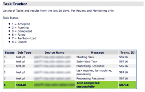
In the two pictures that follow, you’ll see the original report and the modified report. Very little HTML markup has been used in either case as the site needed to be functional and was slated to have a web designer make it look nice. Seven years later and the site still didn’t get the facelift it needed.
In the first graphic, you can see a legend that details what each of the status updates for each step were. We have information repeated that seems somewhat unnecessary. There isn’t any real reason to repeat the Transaction ID, Device Name, or Job Type. It is questionable whether Job Type is a very descriptive title.
In the second graphic, we’ve consolidated the data that was duplicated in the prior graphic. The Task ID, Final Status, Task and Device are given once, and the individual status checks are given below with the status of each step enumerated. The task completion color is given at the top of the task rather than the bottom which I believe is more logical. The mind doesn’t want to look at the data that led to a status. You want to quickly look for tasks that failed and then look for the detail. Since you read top to bottom, searching for a red status would allow you to look at the results below.
In both cases, the important data is bold. I believe that is important as scanning the page draws the eye to the important data and the less important data can be analyzed if there is a need.
The two pictures that follow show how feng-gui.com believes the eye will react when looking at that page. Based on the 2nd screenshot, I believe we’ve reached the goal of making the page present the data clearly and concisely.
One page down, two hundred to go. :)
Tags: user interface design


