Redesign of one of the forms in the Control Panel
One of the biggest problems I had with the old control panel was that certain functions really weren’t well thought out, so, using the control panel was quite cumbersome. Some of the earlier redesigns of the Task Status Report made a large impact. Making the report easy to read and to convey the critical information very quickly was one of the goals.
The primary goal was to make sure that it was as easy to use the Control Panel to do things as it was to start an ssh session and do things manually. But, we needed to make the form easy enough for people to use that didn’t know what they needed.
Easy enough for everyone, still quick enough for someone that knows precisely what they want.
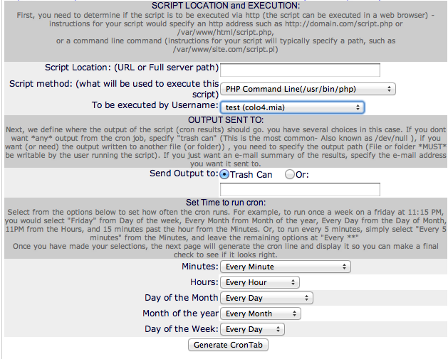
The following two screenshots are from the old Control Panel. Arguably one could say that the Simple interface was harder to use than the Advanced interface.
Simple Cronjob Entry Form

Advanced Cronjob Entry Form

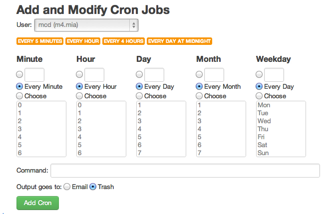
The replacement Cron Job entry page:

With a few buttons to allow very commonly entered options to be selected, adding a cron job becomes quite easy. I have debated whether to add a single line entry that just takes the raw crontab entry so that people don’t need to parse it and fill in the form.
Sometimes, forms can be usable.
Tags: cron